interactive multi-media gallery
Allows multi-media gallery to be have workflows and alerts to be triggered when a particular action is performed.
KEY HIGHLIGHTS
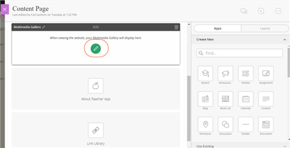
- The Multimedia Gallery application is designed to display both images and embedded videos. It supports embedded images from any third party vendor that supports iFrame embeds.
- Because of its capability to display a photo title and caption text for each image as well as link to additional information, this app is a versatile way to display your most noteworthy content or photos.
- The Multimedia Gallery application comes in all shapes and sizes—from a full screen rotator to smaller (fixed size) versions.
- It is available for the homepage image area on custom templates as well as templates as an Interactive Element, but the default Multimedia Gallery application can be used in other homepage or subpage regions on all templates.
BENEFITS
Audio –
Display an audio player with support for MP3 that can be optionally hidden. This is great for showcasing audio interviews.
Video –
Showcase a fullscreen video with support for Kickstarter, Viddler, YouTube, Vimeo, Daily Motion, and Blip.TV with support for captions and alignment.
Content –
The content component is a multi-purpose component that can display a background image, background color, or can split the content into multiple magazine type columns.
Character –
Display a character avatar, title, and small bio to help readers be reminded of key story characters.
Gallery –
The ASE Gallery component allows you to create and manage unlimited story galleries. Each gallery can be displayed as a grid, a thumbnail gallery, stacked, or sequential type gallery, all with caption support.
Chapter –
Creates scroll-to points with large full-screen images as headings.
Image –
The image component displays an image and caption, with optional lightbox. Also allows you to align the image, as well as offset the image so it hangs outside of the content column.
Map –
This component allows you to create a map for your story. You can add markers to the map with custom messages, and even have the map scroll to points as you scroll through the story.
Parallax –
A fullwidth image component with caption and lightbox. As you scroll, the image moves slightly to provide a parallax effect. Includes optional floater parallax item to use for multiple levels of parallax engagement.
Quote –
Show a fullwidth quote with large text, or a standard pull-quote. Control the color and background of the quote component, add parallax effects, and more.
Timeline –
Create a story with a timeline that sticks to the bottom. The timeline works a bit like chapters.
Document –
This component allows you to upload a PDF or image, that is shown to the user once they click the component.
© Copyright 2015-18 Data One Technologies